Python绘制面积折线图,三种用法演示
你好,我是郭震
误差带面积图是比较常用的一种图形展示方法,参与绘图的每个点都有一个上下偏差,误差带名字由此而来。
面积图
误差带面积图,基本代码,一共10个点,有三组数据,如下
x, y, error.import matplotlib.pyplot as plt
import numpy as np
# 生成随机x数据(例如:时间序列)
x = np.arange(1, 11)
# 生成对应的随机y数据
y = np.array([3, 1, 2, 4, 5, 7, 5, 9, 10, 11])
# 生成每个数据点的随机误差大小
error = np.array([1, 3, 2, 2, 2, 2, 2, 1, 1, 1])
# 计算上下误差带
y_upper = y + error
y_lower = y - error
# 创建图表
plt.figure(figsize=(10, 5))
# 绘制面积图,展示误差带
plt.fill_between(x, y_lower, y_upper, color="lightblue", alpha=0.5)
# 绘制折线图,显示主要趋势
plt.plot(x, y, color="blue", alpha=0.7, linewidth=2)
# 添加标题和轴标签
plt.title('Random Data Line and Area Plot with Error Bands')
plt.xlabel('X axis')
plt.ylabel('Y axis')
# 显示图表
plt.show()
绘图结果展示:
绘制子图
一行两列,两个子图:
# 生成随机x数据(例如:时间序列)
x = np.arange(1, 11)
# 生成对应的随机y数据
y = np.array([3, 1, 2, 4, 5, 7, 5, 9, 10, 11])

# 生成每个数据点的随机误差大小
error = np.array([1, 3, 2, 2, 2, 2, 2, 1, 1, 1])

# 计算上下误差带
y_upper = y + error
y_lower = y - error

# 创建图表窗口
plt.figure(figsize=(20, 5))

# 第一个子图
plt.subplot(1, 2, 1)  # 1行2列的第1个
plt.fill_between(x, y_lower, y_upper, color="lightblue", alpha=0.5)
plt.plot(x, y, color="blue", alpha=0.7, linewidth=2)
plt.title('First Plot: Random Data Line and Area Plot with Error Bands')
plt.xlabel('X axis')
plt.ylabel('Y axis')
plt.ylim(-2, 15)  # 设置y轴范围
y = np.array([5, 6, 8, 6, 8, 7, 8, 9, 12, 11])
y_upper = y + error
y_lower = y - error
# 第二个子图
plt.subplot(1, 2, 2)  # 1行2列的第2个
plt.fill_between(x, y_lower, y_upper, color="lightgreen", alpha=0.5)
plt.plot(x, y, color="green", alpha=0.7, linewidth=2)
plt.title('Second Plot: Random Data Line and Area Plot with Error Bands')
plt.xlabel('X axis')
plt.ylabel('Y axis')
plt.ylim(-2, 15)  # 设置y轴范围
# 显示整个图表窗口
plt.show()
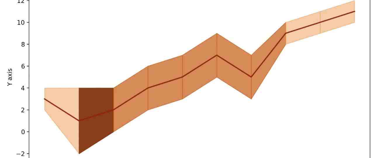
定制显示
颜色带中,误差越大,颜色显示越深:
import matplotlib.pyplot as plt
import numpy as np

# 生成随机x数据(例如:时间序列)
x = np.arange(1, 11)
# 生成对应的随机y数据
y = np.array([3, 1, 2, 4, 5, 7, 5, 9, 10, 11])

# 生成每个数据点的随机误差大小
error = np.array([1, 3, 2, 2, 2, 2, 2, 1, 1, 1])

# 计算上下误差带
y_upper = y + error
y_lower = y - error

# 创建图表
plt.figure(figsize=(10, 5))

# 使用橙色调,透明度变化来模拟颜色深浅
colors = plt.cm.Oranges(np.linspace(0.3, 1, 100))  # 使用100个颜色渐变

for i in range(len(x) - 1):
# 计算每个区间的误差,透明度与误差成正比
    alpha = 0.3 + 0.7 * (error[i] / max(error))
# 选择颜色索引,颜色随误差增大而深化
    color_index = int((error[i] / max(error)) * 99)  # 用99是因为颜色索引从0到99
    plt.fill_between(x[i:i+2], y_lower[i:i+2], y_upper[i:i+2], color=colors[color_index], alpha=alpha)

# 绘制折线图,显示主要趋势
plt.plot(x, y, color="darkred", alpha=0.9, linewidth=2)

# 添加标题和轴标签
plt.title('Data Line and Area Plot with Variable Error Transparency in Orange')
plt.xlabel('X axis')
plt.ylabel('Y axis')

# 显示图表
plt.show()
我打造了一个《Python从零到高薪就业全栈视频课》,目前上线700节课程,每节课15分钟,总共超180个小时。包括:《从零学Python》、《Python进阶》、《爬虫》、《NumPy数值分析》、《Pandas数据分析》、《Matplotlib和Pyecharts绘图》、《PyQt软件开发》、《接单项目串讲》、《Python办公自动化》、《多线程和多进程》、《unittest和pytest自动化测试》、《Flask和Django网站开发》、《基础算法》、《人工智能入门》、《机器学习》、《深度学习》、《Pytorch实战》,将我过去工作8年以及现在科研的经历都融入到课程中,里面有很多实际项目,是一个全栈技术课。如果你想掌握全栈开发技术,提升你自己,提升就业能力,多学技能做副业项目赚钱等,可以报名,课程带有我的答疑。价格现在比较优惠,推荐现在加入。长按下方二维码查看,报名后加我微信:gz113097485

阅读原文 如果你想掌握全栈开发技术,提升你自己,提升就业能力,多学技能做副业项目赚钱等,可以报名,课程带有我的答疑。
价格现在比较优惠,推荐现在加入。长按下方二维码查看,报名后加我微信:gz113097485
最新评论
推荐文章
作者最新文章
你可能感兴趣的文章
Copyright Disclaimer: The copyright of contents (including texts, images, videos and audios) posted above belong to the User who shared or the third-party website which the User shared from. If you found your copyright have been infringed, please send a DMCA takedown notice to [email protected]. For more detail of the source, please click on the button "Read Original Post" below. For other communications, please send to [email protected].
版权声明:以上内容为用户推荐收藏至CareerEngine平台,其内容(含文字、图片、视频、音频等)及知识版权均属用户或用户转发自的第三方网站,如涉嫌侵权,请通知[email protected]进行信息删除。如需查看信息来源,请点击“查看原文”。如需洽谈其它事宜,请联系[email protected]。
版权声明:以上内容为用户推荐收藏至CareerEngine平台,其内容(含文字、图片、视频、音频等)及知识版权均属用户或用户转发自的第三方网站,如涉嫌侵权,请通知[email protected]进行信息删除。如需查看信息来源,请点击“查看原文”。如需洽谈其它事宜,请联系[email protected]。