用 matplotlib 绘制 3D 时间序列动态图


时间序列动态图是显示时间演变的非常强大的工具,但 matplotlib 的默认动态图很简单,不太适合用于比较多个时间序列。
动态图被广泛使用:从解释神经网络如何训练,到显示合成时间序列统计数据或波动率异常时应该选择何种基金等问题。
假设我们想知道在新冠病毒流行期间哪个股票市场的发展最好,怎样使人们都可以直观的判断出来呢?我建议创建动态图,因为它更简明、更清晰。我们从 2D 开始,到 3D,最后用 3D 网格来表示。
由于这篇文章的目的是改进时间序列动画,我们将使用 GDP(国内生产总值)最高的 10 个欧洲国家的股票指数演变作为数据。
2019年GDP最高的欧洲国家(不包括俄罗斯和土耳其)是:
| # | Country | Country code | Stock Index |
| 1 | Germany | GER | DAX |
| 2 | United Kingdom | UK | UKX |
| 3 | France | FR | CAC |
| 4 | Italy | IT | FTSEMIB |
| 5 | Spain | ES | IBEX |
| 6 | Netherlands | NL | AEX |
| 7 | Switzerland | CH | SMI |
| 8 | Poland* | PL | WIG |
| 9 | Sweden | SE | OMX |
| 10 | Belgium | BE | BEL20 |
为了比较 2020 年欧洲股票指数的涨跌,所有动态图都显示了指数从 01/01/2019 到 29/01/2021 1 年(261 天)的的滚动股价 。
2D动态图
第一种方法是创建所有滚动股价的2D线图:
def update_lines_2D(num, data, columns, dates, cmap, lines, ax):
'''
    Function that updates the lines of a plot in 2D
    '''

# get the slice
    current_slice = data[num:261+num, :]
    current_dates = dates[num:261+num]

# for each index...
for i in range(current_slice.shape[1]):

# get the coordinates
        x = np.array(np.arange(current_slice.shape[0]))
        y = np.array(current_slice[:, i])

# crete points and segments to color
        points = np.array([x, y]).T.reshape(-1, 1, 2)
        segments = np.concatenate([points[:-1], points[1:]], axis=1)

# Create a continuous norm to map from data points to colors
        norm = plt.Normalize(-0.22, 0.22)
        lines[i].set_segments(segments)
        lines[i].set_array(y)
        lines[i].set_color(cmap(y[-1] * 2.5 + 0.5))

# update the ticks and labels
    ax.set_xticklabels([dates[int(val)+num].strftime('%m/%y') for val in ax.get_xticks()[:-1]] + [''])
    ax.legend(loc='center right', bbox_to_anchor=(1.32, 0.5), fancybox=True, facecolor=(.95,.95,.95,1), framealpha=1, shadow=False, frameon=True, ncol=1, columnspacing=0, prop={'family': 'DejaVu Sans Mono'})

# return the lines
return lines


def init_lines_2D():
'''
    Function that initiates the lines of a plot in 2D
    '''
for line in lines:
        line.set_array([])
return lines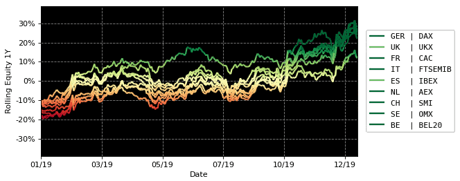
动画看起来很酷,但是当线条在时间上重叠时很难比较索引,因为它们具有相同的颜色图。
这可以通过为每个索引选择不同的颜色来解决,但会降低绘图的可读性。
3D动态图
在第二种方法中,添加了第三维。它在给定的 z 坐标中分隔每个索引,创建以下动画:
def update_lines_3D(num, data, columns, dates, cmap, lines, ax):
'''
    Function that updates the lines of a plot in 2D
    '''

# get the slice
    current_slice = data[num:261+num, :]
    current_dates = dates[num:261+num]

# for each index...
for i in range(current_slice.shape[1]):

# get the coordinates
        x = np.arange(current_slice.shape[0])
        y = np.tile(i, current_slice.shape[0])
        z = np.array(current_slice[:, i])

# crete points and segments to color
        points = np.array([x, y, z]).T.reshape(-1, 1, 3)
        segments = np.concatenate([points[:-1], points[1:]], axis=1)

# Create a continuous norm to map from data points to colors
        norm = plt.Normalize(-0.19, 0.19)
        lines[i].set_segments(segments)
        lines[i].set_array(z)
        lines[i].set_color(cmap(z[-1] * 2.5 + 0.5))

# update the ticks and labels
    ax.set_xticklabels([dates[int(val)+num].strftime('%m/%y') for val in ax.get_xticks()[:-1]] + [''], rotation=0, fontdict={'verticalalignment': 'top', 'horizontalalignment': 'center'})
    ax.legend(loc='center right', bbox_to_anchor=(1.1, 0.46), fancybox=True, facecolor=(.95,.95,.95,1), framealpha=1, shadow=False, frameon=True, ncol=1, columnspacing=0, prop={'family': 'DejaVu Sans Mono'})

# return the lines
return lines

def init_lines_3D():
for line in lines:
        line.set_array([])
return lines
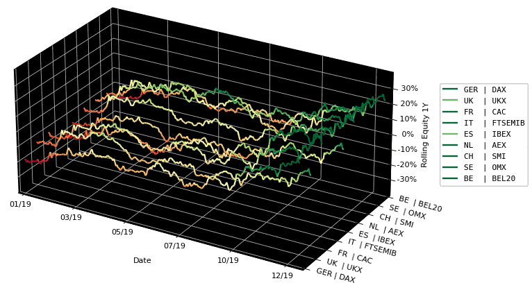
这个动画看起来比2D版本更酷,但它有一个很大的缺点:深度感完全丧失,不同项目进行比较非常困难。不过我们可以添加一个网格。
3D网格动态图
最后,添加一条连接每个时间步长的所有值的线,创建网格:
def update_mesh_lines_3D(num, data, columns, dates, cmap, lines, mesh_lines, ax):
'''
    Function that updates the lines of a plot in 2D
    '''

# get the slice
#     current_slice = data[num:261+num, :]
    current_slice = data[num:int(261/2)+num, :]

# for each index...
for i in range(current_slice.shape[1]):

# get the coordinates
        x = np.arange(current_slice.shape[0])
        y = np.tile(i, current_slice.shape[0])
        z = np.array(current_slice[:, i])

# crete points and segments to color
        points = np.array([x, y, z]).T.reshape(-1, 1, 3)
        segments = np.concatenate([points[:-1], points[1:]], axis=1)

# Create a continuous norm to map from data points to colors
        norm = plt.Normalize(-0.19, 0.19)
        lines[i].set_segments(segments)
        lines[i].set_array(z)
        lines[i].set_color(cmap(z[-1] * 2.5 + 0.5))

# counter to check the current mesh line
    counter = 0

# for each day...
for j in range(current_slice.shape[0]):

if j % 1 == 0:

# get the coordinates
            x = np.tile(j, current_slice.shape[1])
            y = np.arange(current_slice.shape[1])
            z = np.array(current_slice[j, :])

# crete points and segments to color
            points = np.array([x, y, z]).T.reshape(-1, 1, 3)
            segments = np.concatenate([points[:-1], points[1:]], axis=1)

# Set the values used for colormapping
            norm = plt.Normalize(-0.22, 0.22)
            mesh_lines[counter].set_segments(segments)
            mesh_lines[counter].set_array(z)
            counter += 1

# update the ticks and labels
    ax.set_xticklabels([dates[int(val)+num].strftime('%m/%y') for val in ax.get_xticks()[:-1]] + [''], rotation=0, fontdict={'verticalalignment': 'top', 'horizontalalignment': 'center'})
    ax.legend(loc='center right', bbox_to_anchor=(1.1, 0.46), fancybox=True, facecolor=(.95,.95,.95,1), framealpha=1, shadow=False, frameon=True, ncol=1, columnspacing=0, prop={'family': 'DejaVu Sans Mono'})

# return the lines
return lines

def init_mesh_lines_3D():
for line in lines:
        line.set_array([])
return lines
看看这个动画,网格确实有助于以更清晰的方式比较指数随时间的变化情况,从而得出更好的结论。
结论
从3D网格图中,可以得出以下结论:
UKX(英国)和IBEX(ES)是下跌前和复苏期间最弱的指数。DAX (GER)、OMX (SE)、SMI (CH) 和 AEX (NL) 是下跌前和复苏期间最强的指数。CAC (FR)、FTSEMIB (IT) 和 BEL20 (BE) 在秋季之前是最强的,它们有很小的恢复。看看 2D 动态图,人们可能会得出相同的结论,但会变得更难。
- EOF -
觉得本文对你有帮助?请分享给更多人
推荐关注「Python开发者」,提升Python技能
点赞和在看就是最大的支持❤️
阅读原文 最新评论
推荐文章
作者最新文章
你可能感兴趣的文章
Copyright Disclaimer: The copyright of contents (including texts, images, videos and audios) posted above belong to the User who shared or the third-party website which the User shared from. If you found your copyright have been infringed, please send a DMCA takedown notice to [email protected]. For more detail of the source, please click on the button "Read Original Post" below. For other communications, please send to [email protected].
版权声明:以上内容为用户推荐收藏至CareerEngine平台,其内容(含文字、图片、视频、音频等)及知识版权均属用户或用户转发自的第三方网站,如涉嫌侵权,请通知[email protected]进行信息删除。如需查看信息来源,请点击“查看原文”。如需洽谈其它事宜,请联系[email protected]。
版权声明:以上内容为用户推荐收藏至CareerEngine平台,其内容(含文字、图片、视频、音频等)及知识版权均属用户或用户转发自的第三方网站,如涉嫌侵权,请通知[email protected]进行信息删除。如需查看信息来源,请点击“查看原文”。如需洽谈其它事宜,请联系[email protected]。