被极简的LOGO,你还认得吗?


来源/设计达人
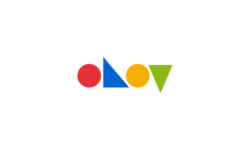
Logo可以反映出一个品牌的精髓,是公司的核心身份,是重要的企业形象。然而要做一个好的标志并能带有良好的识别性,这是一件考虑设计师能力事情。
葡萄牙设计师 Pedro Almeida 最近做的一个Logo设计项目很有意思,他把各大著名品牌标志都转为极简化设计,保留独特的线条、形状以及Logo的主色调,从而创造出令人印象深刻的标志。

苹果

联邦快递

Continental – tyres
易趣

必胜客

Land RoverLand Rover

Twitter

Vodafone
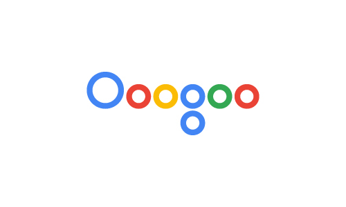
google

花花公子
Instagram
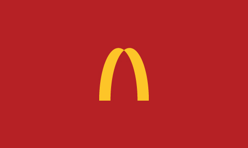
麦当劳

壳牌

Volvo

宝马

Youtube

亚马逊

三星

宜家

可口可乐
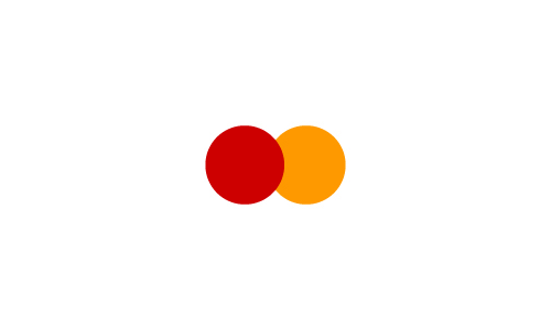
万事达
文末可评论!
推荐微信
摄无忌惮 微信/ Fpicture (长按可复制)

■投 稿 联系微信/boilway
阅读原文 最新评论
推荐文章
作者最新文章
你可能感兴趣的文章
Copyright Disclaimer: The copyright of contents (including texts, images, videos and audios) posted above belong to the User who shared or the third-party website which the User shared from. If you found your copyright have been infringed, please send a DMCA takedown notice to [email protected]. For more detail of the source, please click on the button "Read Original Post" below. For other communications, please send to [email protected].
版权声明:以上内容为用户推荐收藏至CareerEngine平台,其内容(含文字、图片、视频、音频等)及知识版权均属用户或用户转发自的第三方网站,如涉嫌侵权,请通知[email protected]进行信息删除。如需查看信息来源,请点击“查看原文”。如需洽谈其它事宜,请联系[email protected]。
版权声明:以上内容为用户推荐收藏至CareerEngine平台,其内容(含文字、图片、视频、音频等)及知识版权均属用户或用户转发自的第三方网站,如涉嫌侵权,请通知[email protected]进行信息删除。如需查看信息来源,请点击“查看原文”。如需洽谈其它事宜,请联系[email protected]。